By Abhishek Patel · June 30, 2026
If you’re hunting for a single place to turn raw hiring data into actionable insight, the Recruitment Analytics Dashboard is your new best friend. In the first 100 words you’ll see why it matters, which metrics matter most, and how to turn those numbers into stories that move the needle. Let’s dive in.
What Is a Recruitment Analytics Dashboard?
Definition and core components
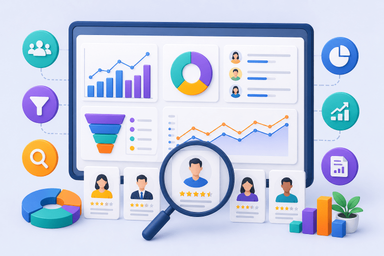
A recruitment analytics dashboard is a visual hub that pulls data from your ATS, HRIS, and even your interview tools into one real‑time screen. It typically includes charts, tables, and drill‑downs that let you see everything from source effectiveness to candidate experience at a glance. Think of it as the cockpit for talent acquisition – you get altitude, speed, and fuel levels all at once.
Why Recruitment Dashboards Matter
Business impact and stakeholder benefits
When you can answer “how long does it take to fill a role?” in seconds, you save time and money. Executives love seeing ROI, hiring managers crave clarity on bottlenecks, and recruiters need daily nudges to improve performance. A well‑crafted dashboard turns vague gut feelings into hard numbers that justify budget, shape strategy, and boost employer brand.
Essential Recruitment Dashboard Metrics
Time to Hire, Time to Fill, Cost per Hire, Source Effectiveness, Quality of Hire, Diversity, Candidate Experience, cNPS
These eight metrics form the backbone of any talent acquisition dashboard. Time to Hire (from requisition to offer) tells you speed; Time to Fill (from posting to start date) adds the onboarding lag. Cost per Hire breaks down spend on ads, agencies, and tech. Source Effectiveness shows which job boards actually deliver hires, while Quality of Hire links new employee performance back to the hiring channel.
Diversity percentages and candidate experience scores (often measured by cNPS) let you gauge fairness and brand perception. Together they paint a holistic picture of recruitment performance metrics that matter to finance, compliance, and culture teams.
Recruitment Funnel Dashboard
Stages, conversion rates, bottleneck analysis
Imagine a funnel where each stage – Application, Screen, Interview, Offer, Acceptance – is a slice of a donut chart. Conversion rates between stages reveal where candidates drop off, a key factor in improving candidate experience in enterprise recruitment. If you see a 45% fall‑off between Screen and Interview, you’ve identified a bottleneck worth investigating. Plotting these rates weekly highlights trends and helps you test interventions like faster screen feedback.
Executive Recruitment Dashboard
High‑level KPIs, trend visualizations, ROI focus
Executives don’t need to see every click; they want the big picture. An executive dashboard showcases high‑level KPIs such as Time to Fill, Cost per Hire, and cNPS over the last 12 months. Trend lines and year‑over‑year bars make it easy to spot whether the talent pipeline is getting stronger or weaker. Add a simple ROI gauge – total hiring spend vs. revenue generated by new hires – and you’ve got a story that boards love.
Recruiter Performance Dashboard
Individual metrics, activity tracking, win‑rate
On the recruiter level, the dashboard becomes a personal scoreboard. Metrics like number of requisitions owned, interviews scheduled, offers extended, and win‑rate (offers accepted / offers made) give a clear view of productivity. Pair that with activity heat maps to see when each recruiter is most effective, and you’ve got a tool for coaching, recognition, and goal‑setting.
Recruitment Reporting Framework
Data collection, cadence, benchmarking, storytelling
Collecting data is only half the battle. You need a reporting cadence – weekly snapshots for recruiters, monthly summaries for managers, quarterly deep dives for executives. Benchmark against industry standards (e.g., 30‑day average Time to Fill for tech roles) and weave those numbers into a narrative. Ask yourself: What does this trend mean for our hiring budget? What story does the data tell about our employer brand?
Best Practices for Building Recruitment Dashboards
Visualization rules, KPI alignment, data governance
Start with a single, clear KPI per visual. Too many colors confuse the eye; stick to a palette of three shades plus neutrals. Align each metric with a business outcome – for example, link Source Effectiveness directly to Cost per Hire savings. And never ignore data governance: define who can edit, who can view, and how often data refreshes. A disciplined approach prevents stale numbers from slipping into decisions.
Common Recruitment Dashboard Mistakes
Over‑loading, stale data, lack of context
One of the biggest sins is cramming every metric onto one screen. Users end up scrolling endlessly and miss the insights that matter. Stale data – a dashboard that updates only monthly – feels irrelevant in a fast‑moving hiring market. And without context (like historical averages or market benchmarks), numbers sit in a vacuum. Keep it lean, keep it fresh, and always add a frame of reference.
AI Powered Recruitment Dashboards
Predictive hiring, automated insights, recommendation engines
Tools like TAD (Dashboard) provide a single source of truth for recruitment funnel analytics, taking the guesswork out of talent forecasting. SmartScore™ unifies hiring signals into a 0‑100 color‑coded score, empowering predictive models to flag roles likely to go open in the next 90 days based on turnover patterns. Automated insights highlight, for example, that candidates sourced from employee referrals have a 20% higher win‑rate, a trend explored in our piece on the role of generative AI in talent acquisition and recruiting operations. Recommendation engines even suggest the next best interview slot to reduce Time to Hire by up to 15%.
How to Choose Recruitment Dashboard Software
Integration, scalability, user experience, pricing
First, verify integration hooks with your ATS, HRIS, and CRM – a dashboard that lives in a silo is a wasted investment. Next, think scalability: can it handle 500,000 candidate records if you grow globally? User experience matters too; drag‑and‑drop builders let hiring managers create ad‑hoc views without IT. Finally, compare pricing models – subscription vs. per‑seat – and match them to your expected adoption rate.
Data Privacy and Security Considerations
Protecting candidate information
Recruitment data is personally identifiable information, so GDPR, EEOC, and local privacy laws apply; see our detailed guide on Recruitment Compliance: EEOC, GDPR, and AI Hiring Regulations Explained for a deeper dive. Choose software that offers encryption at rest and in transit, role‑based access controls, and audit logs. Conduct a quarterly privacy review and document how long you retain candidate data – many organizations purge records after 24 months to stay compliant.
Integration Strategies with ATS and HRIS
Seamless data flow for accurate reporting
Most modern tools use APIs to pull data in real time. Map key fields – job ID, candidate ID, hire date – across systems to avoid duplication. A common trick is to set up a data warehouse where raw ATS data lands, then let the dashboard query that warehouse. This decouples reporting from the live ATS and keeps performance snappy.
Future Trends in Recruitment Analytics
Predictive analytics, talent market intelligence, AI driven scenario planning
The next wave will blend external talent market data with internal hiring trends. Imagine a scenario planner that shows the impact of a 10% salary increase on source mix and time to fill. Predictive analytics will become more granular, forecasting not just vacancy timelines but also candidate success scores. Keeping an eye on these trends ensures your dashboard stays ahead of the curve.
Ready‑Made Dashboard Templates and Examples
Power BI and Excel starters
Many vendors ship pre‑built templates for a quick start. A Power BI “Hiring Analytics Dashboard” can be imported in under five minutes and includes Time to Hire, Source Effectiveness, and Diversity visuals. For smaller teams, an Excel workbook with pivot tables and slicers offers a low‑cost alternative. Use these as a sandbox, then customize to your organization’s language.
Visual Design Tips and Sample Screenshots
Making data easy on the eyes
Stick to a grid layout – three columns at most – and use whitespace to separate sections. Highlight key numbers with bold type or a contrasting color. Interactive drill‑downs let users click a bar chart and see underlying raw data. Sample screenshots (not shown here) typically feature a top‑level executive view, a mid‑level recruiter view, and a deep‑dive funnel view.
Putting It All Together
Building a recruitment reporting dashboard isn’t a one‑off project; it’s an evolving practice. Start with core hiring dashboard KPIs, align them to business outcomes, and iterate based on stakeholder feedback. Add AI insights, tighten security, and keep the visual design crisp. When you treat the dashboard as a living narrative rather than a static report, you’ll see faster hires, lower costs, and a stronger employer brand.
Key takeaways: define clear metrics, separate executive and recruiter views, embed a reporting cadence, avoid information overload, and future‑proof with AI and privacy safeguards. Follow this framework and your recruitment analytics dashboard will become the pulse of talent acquisition – not just another spreadsheet.
Frequently Asked Questions
How do I select the most relevant metrics for my recruitment analytics dashboard?
Start by aligning metrics with your hiring goals and stakeholder priorities, such as speed, cost, quality, and diversity. Prioritize high‑impact KPIs like Time to Fill, Cost per Hire, and Source Effectiveness, then add supporting metrics that address specific pain points.
What’s the difference between Time to Hire and Time to Fill?
Time to Fill measures the days from when a requisition opens until an offer is accepted, reflecting overall recruitment speed. Time to Hire tracks the period from a candidate’s first application or contact to the offer acceptance, focusing on the candidate‑centric process.
Which software platforms are best for building recruitment analytics dashboards?
Popular options include iCIMS, Greenhouse, SmartRecruiters, and Lever, which offer built-in reporting and API integrations. For custom visualizations, BI tools like Tableau, Power BI, or Looker can pull data from ATS and HRIS systems.
How frequently should a recruitment dashboard be refreshed?
Update operational KPIs (e.g., daily or weekly) to monitor real‑time pipeline health, while strategic metrics (e.g., monthly or quarterly) are reviewed less often for trend analysis. Align refresh cycles with recruiting cycles and stakeholder reporting needs.
What is candidate Net Promoter Score (cNPS) and how is it calculated?
cNPS measures candidate experience by asking applicants how likely they are to recommend your hiring process on a 0‑10 scale. Subtract the percentage of detractors (0‑6) from promoters (9‑10) to get the cNPS, which can be tracked over time on the dashboard.